Background
Maracaibo is the Capital of Zulia State, a functional urban region of about 2.3 million habitants and 751,000 jobs.
The city had no uniform identity and municipality public services are graphically isolated from each other.
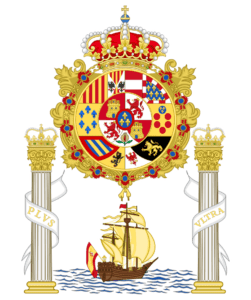
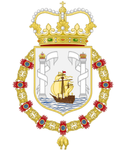
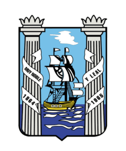
The most consistent identity element is the Maracaibo’s coat of arms which had tree modification through history
The reform of this organization offered an opportunity to unify the city brand into one cohesive visual identity.
Coat of Arms Timeline
Symbol Concept
this poject sought a fresh new brand identity that respects the past of this important port that built the country and represent each of the people living and working there. As a strong brand needs to be adaptive, responsive and versatile.
The idea is to built a sense of belonging for basically everyone, residents, foreigners, tourists, immigrants, special groups, etc.
The new identity was built on recognizable elements for the people, element that are presents in their symbology and also are strong link with their roots.
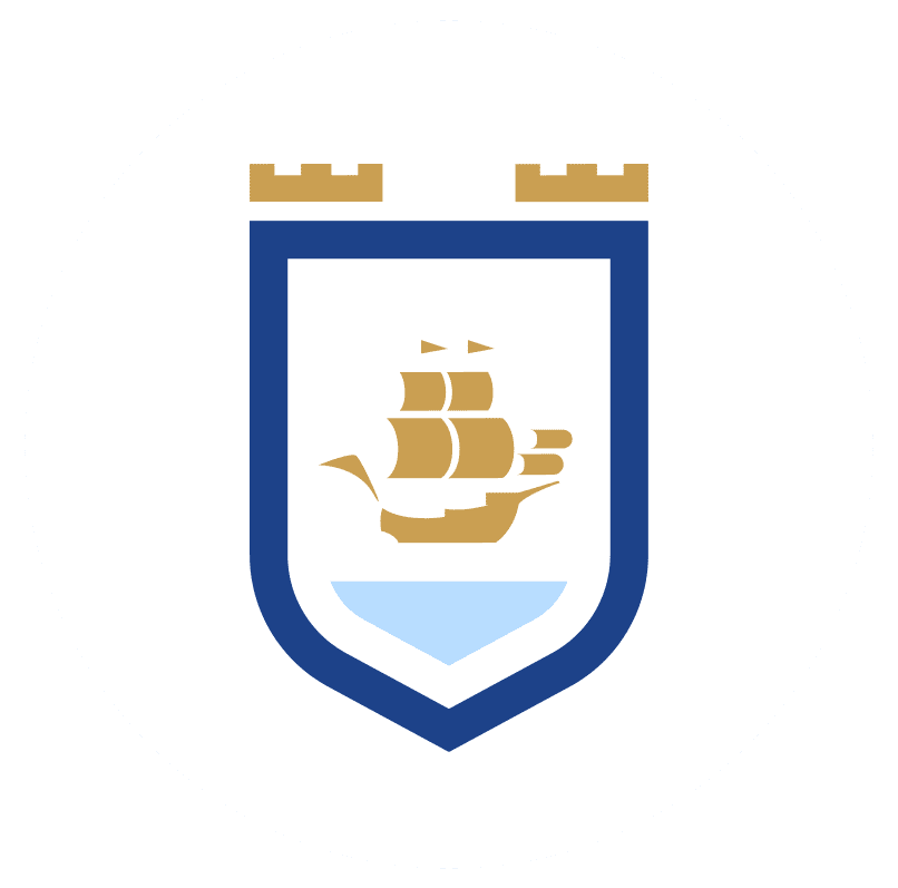
For this reason the concept is anchor to this three main alements, the shield, the columns and the ship.


Typography
Mont Heavy is a geometric sans serif typeface. Svetoslav Simov and Mirela Belova designed this font. It can be used in lots of working areas. Mont is also perfect for strong headlines. It is suitable for web, print, motion graphics.
For body text Open Sans is the option selected, designed by Steve Matteson It was created with an upright stress, open forms and a neutral. It was optimized for print, web, and mobile interfaces and has excellent legibility characteristics in its letterforms.
Color Palette
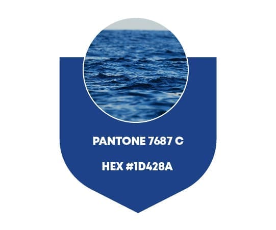
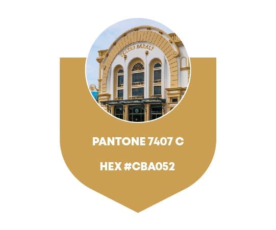
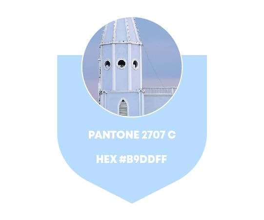
The brand colors are subconsciously familiar to citizens, they are used in regional symobols or some iconic buildings.
Navy blue represents the nature, copper gold is civic life and light blue the divinity of god.
Pantone and Hex codes
1D428A
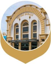
CBA052
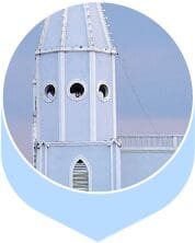
B9DDFF
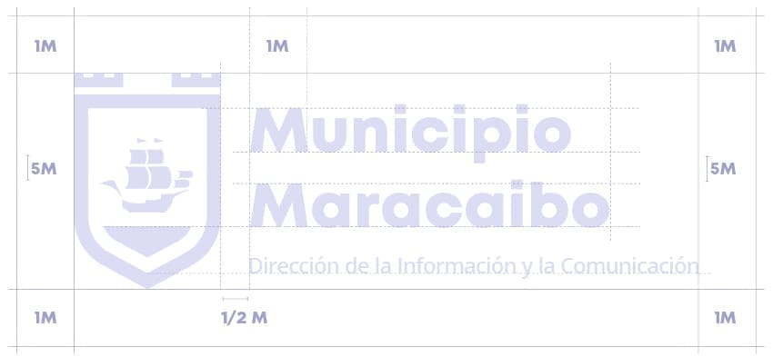
Symbol and Logotype
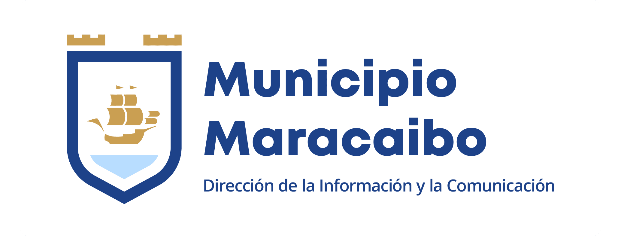
* The third line will vary depending of the department.
Alternative Colors
Monotone Navy Blue
Monotone copper Gold
Monotone Light Blue
Duotone Navy Blue
Duotone copper Gold
Duotone Light Blue

High Contrast
Greyscale
Negative
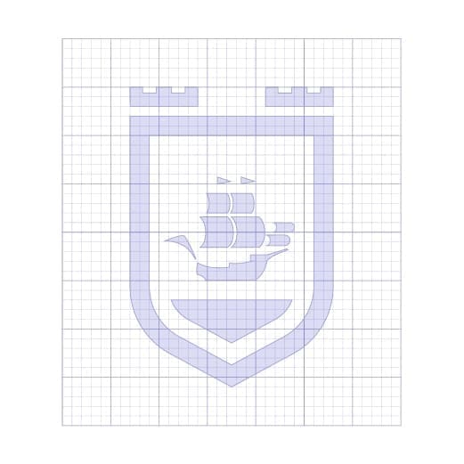
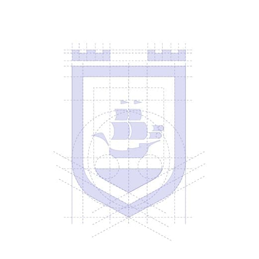
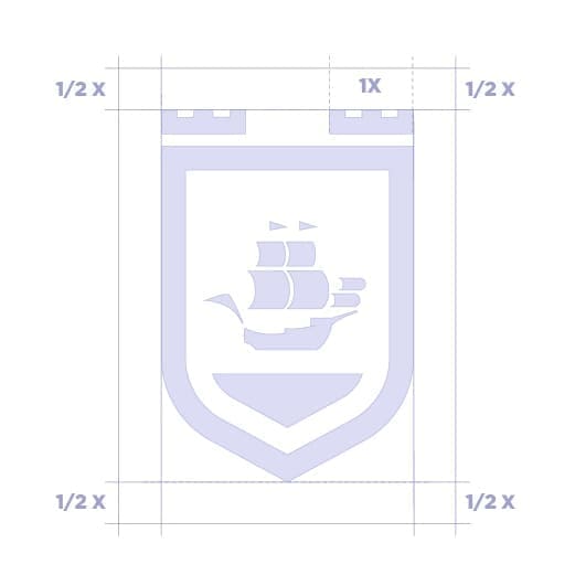
Structural Analysis
Click on image to enlarge
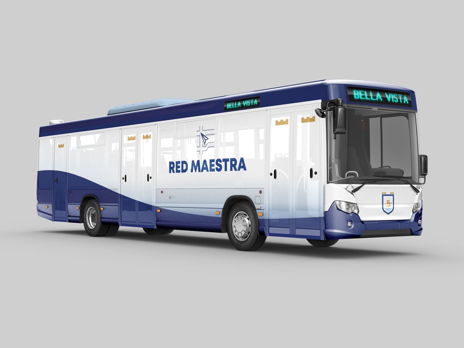
Applications
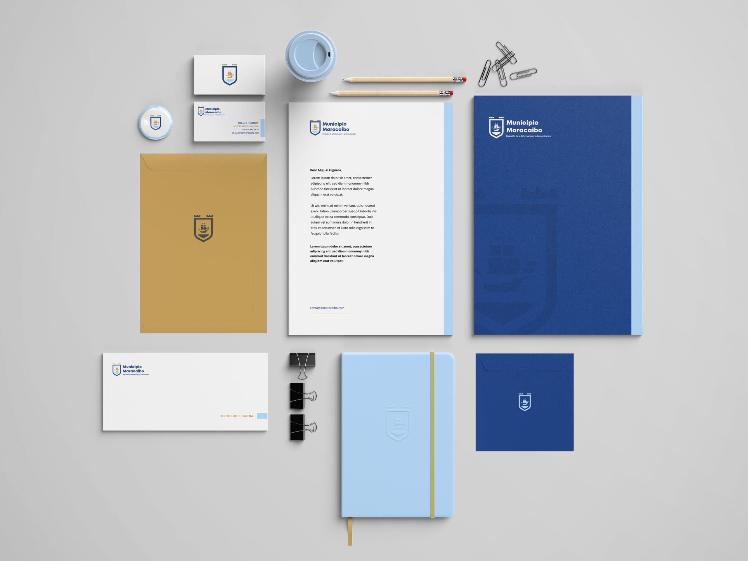
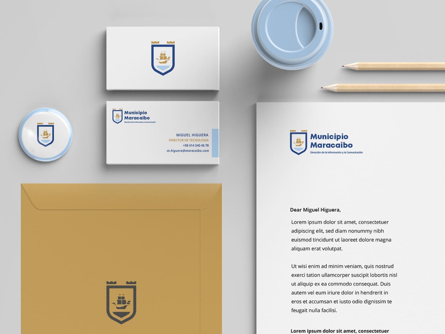
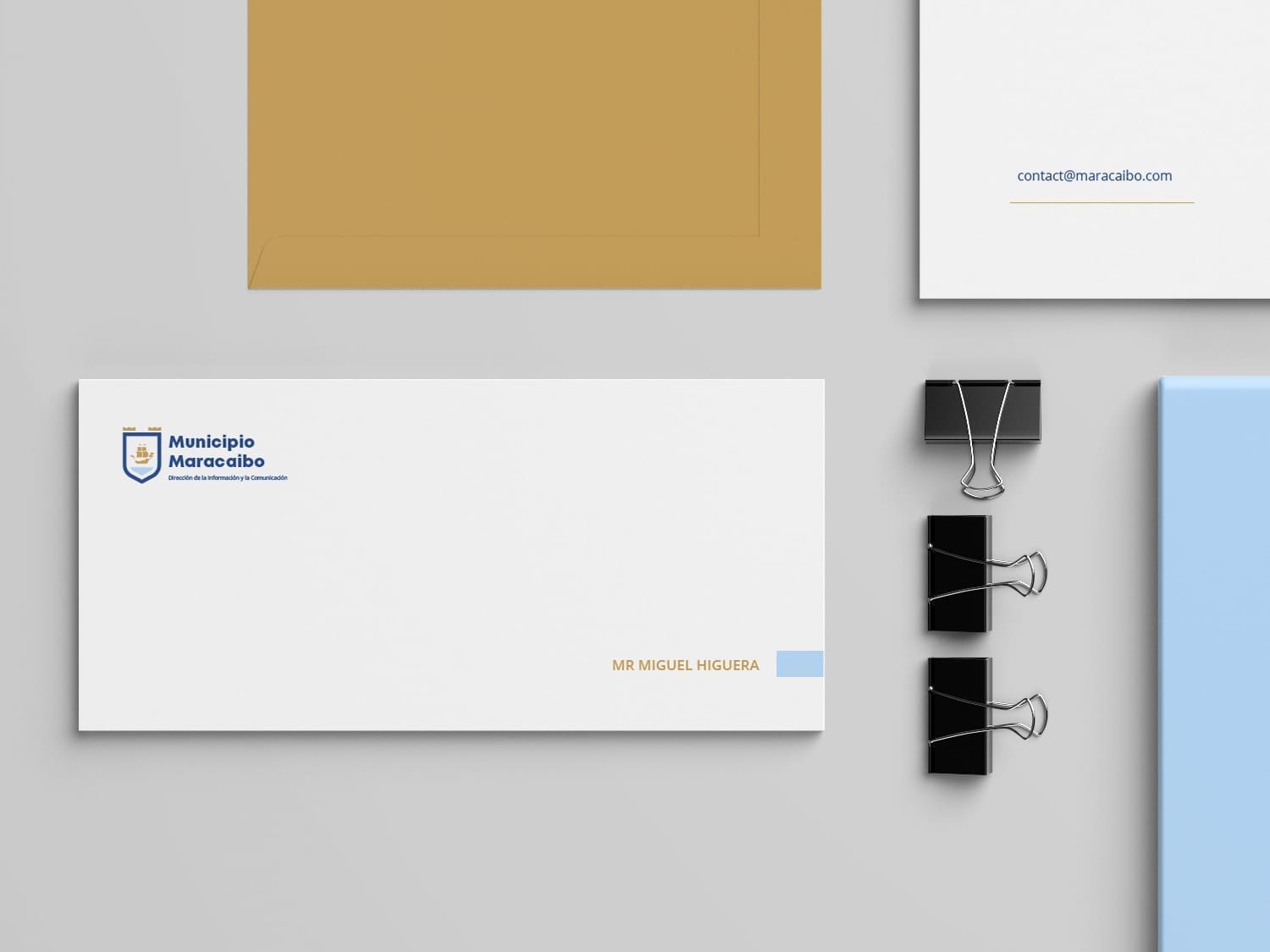
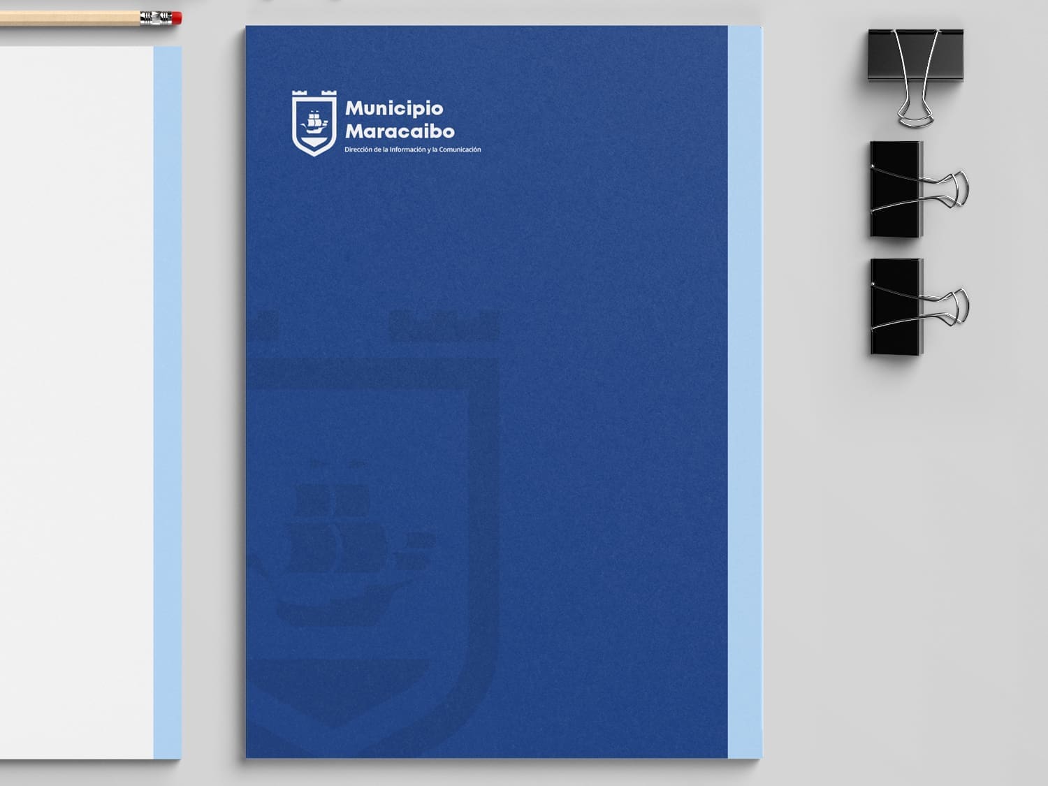
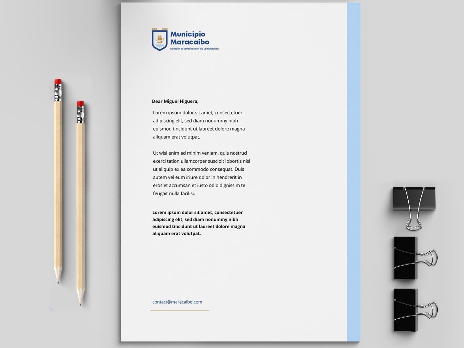
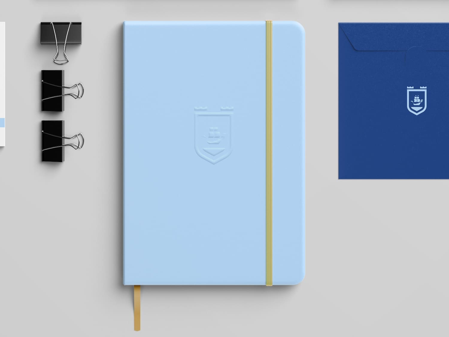
Stationery
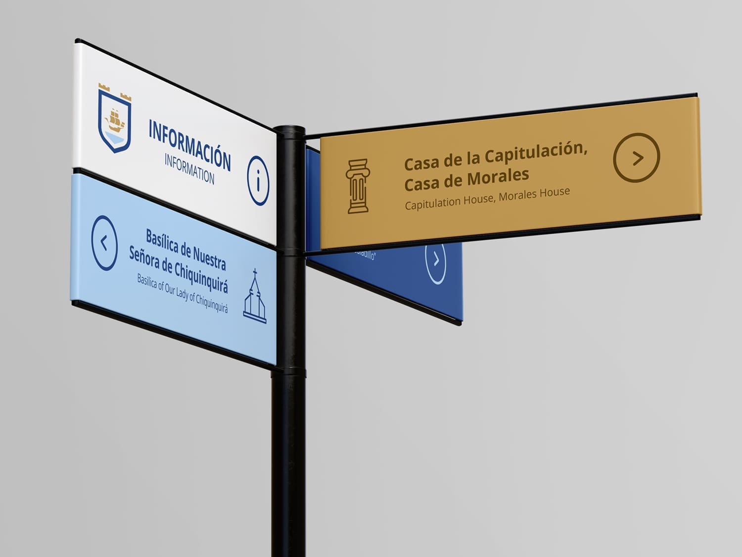
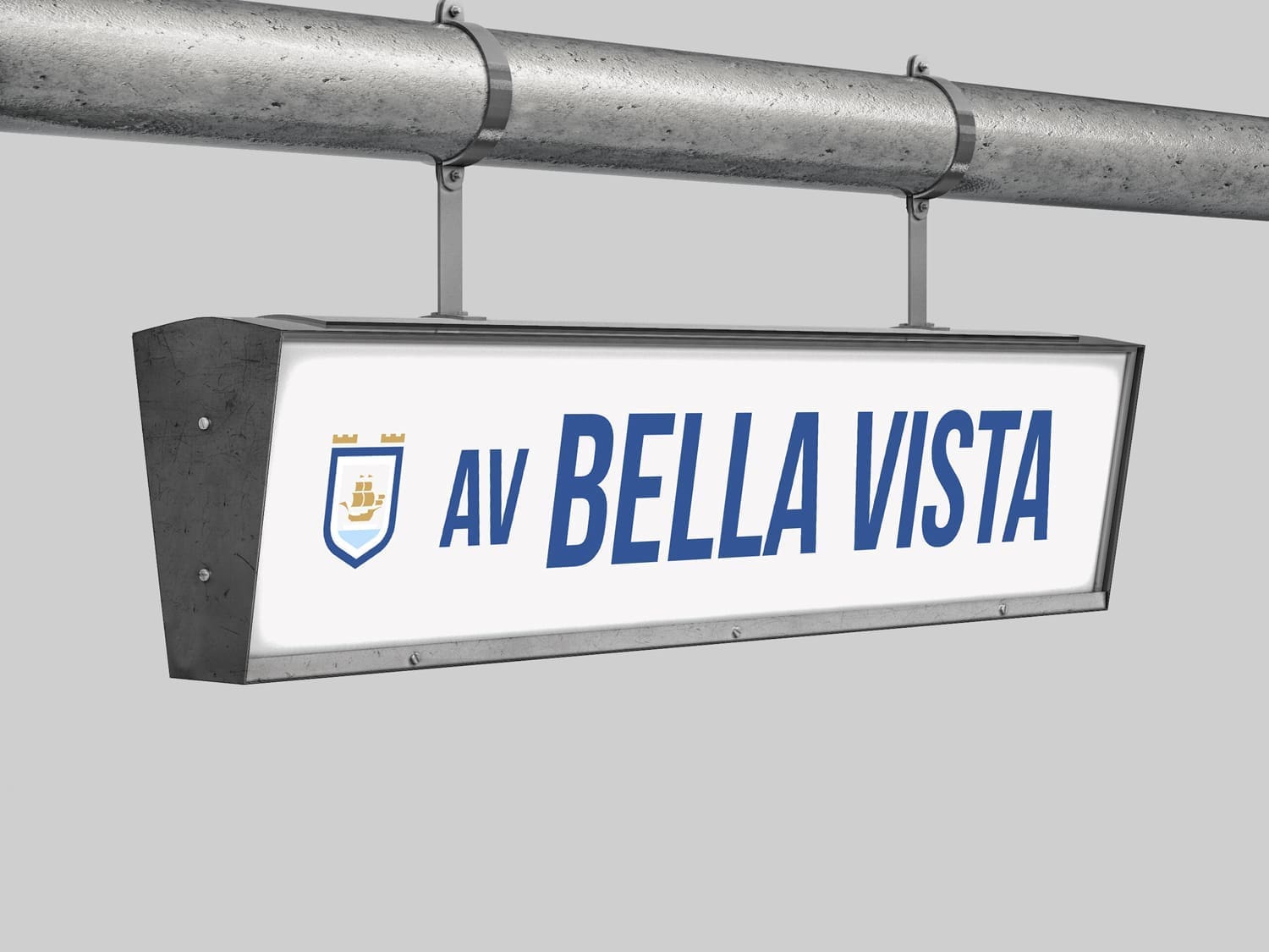
Signage
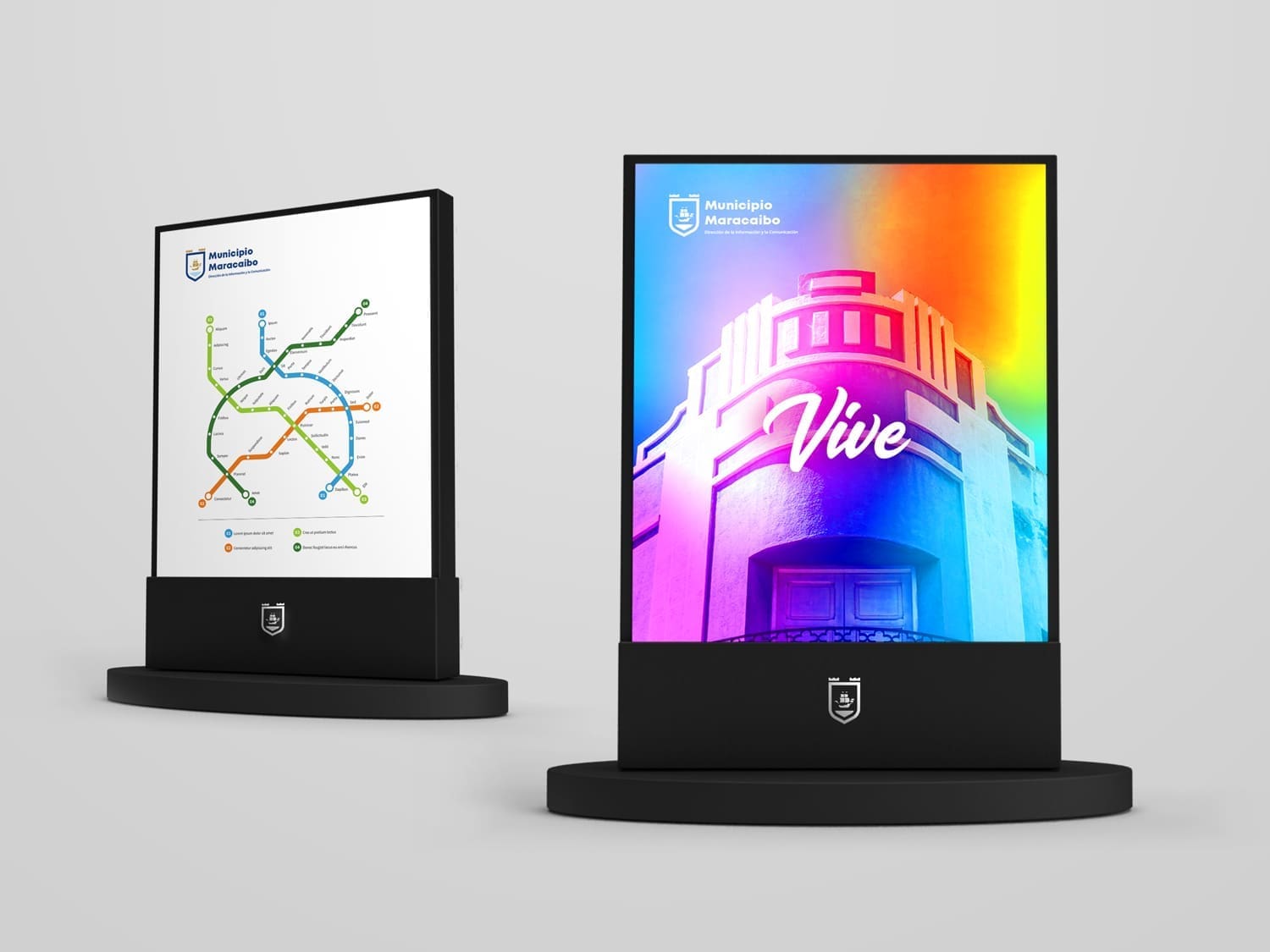
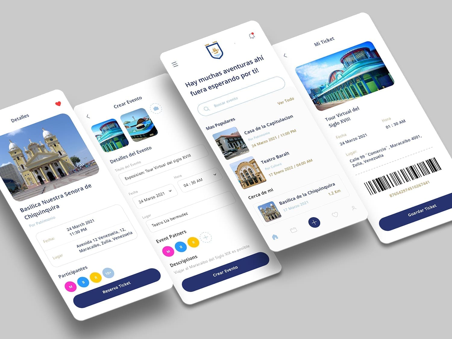
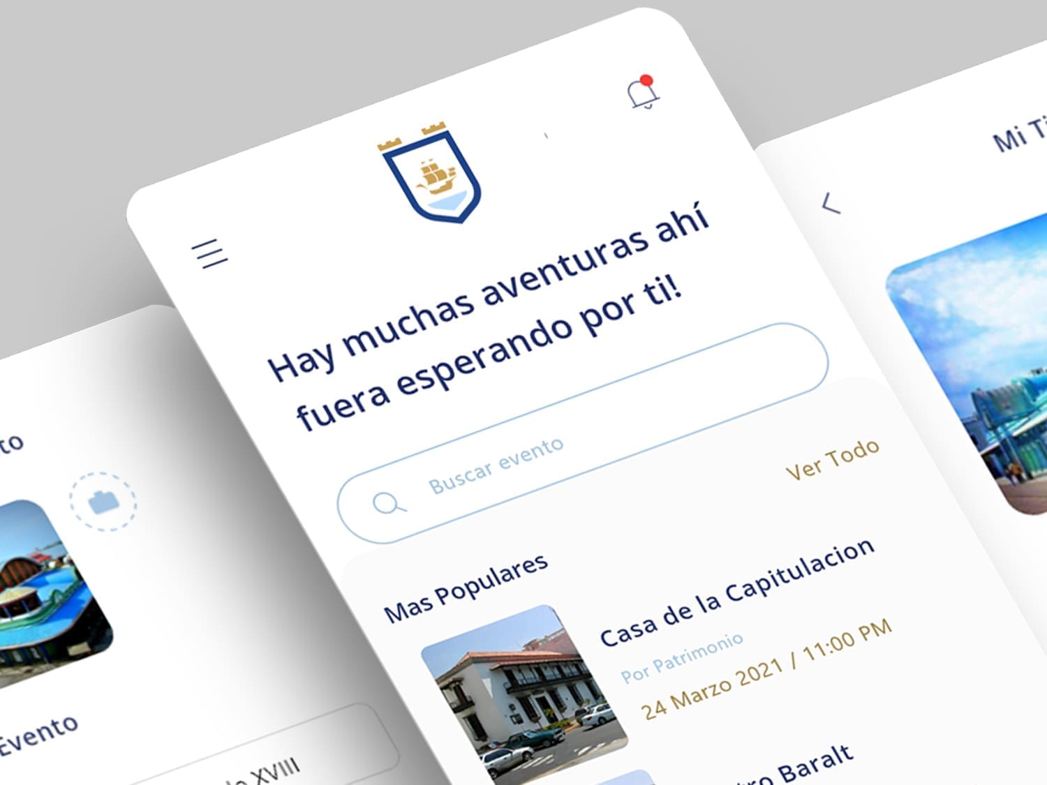
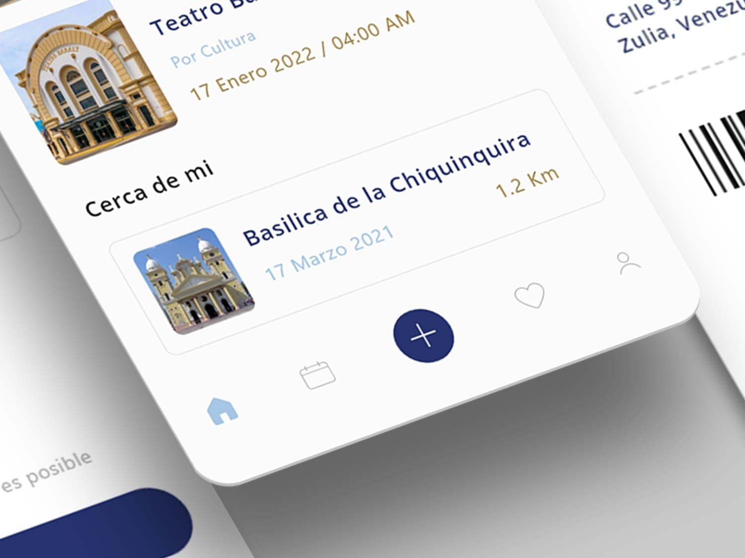
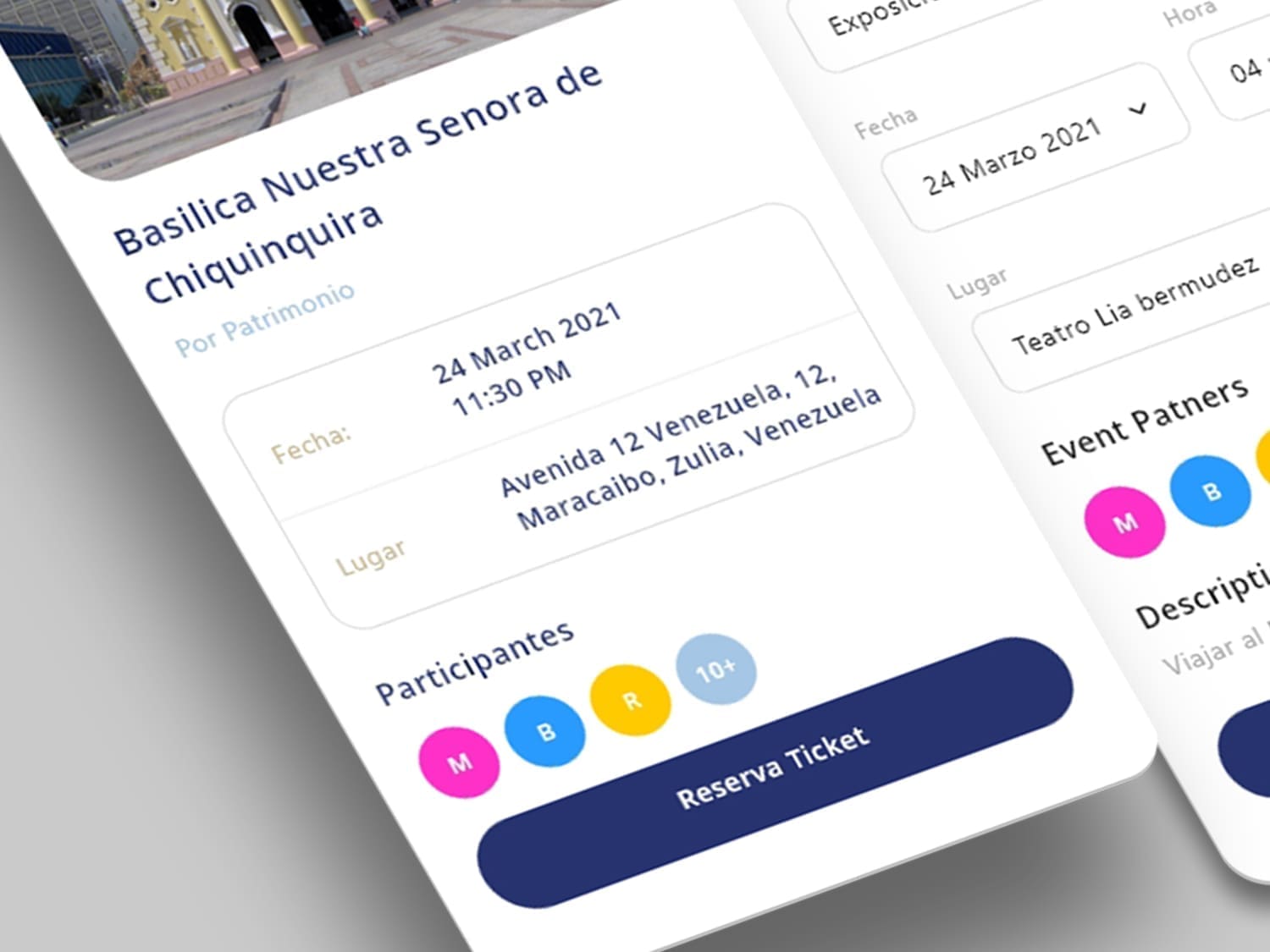
Digital Environments

