Menu

Branding

Why a Rebranding?

In every company, there comes a day when the sparkling gloss has worn off its marking and this is the right moment to begin to think about whether the brand is accomplishing more mischief than anything.

Sometimes you need a rebrand just to maintain your business competitive in a market that is constantly changing and changing.

From my perspective as a Graphic Designer, this company identity is lacking strength to step forward and rich the next level where software and tech companies are heading to. Your brand is a possession that should work for you.

Based on that, In this case there are some elements that can be improved to send the right message. The following analysis it is a diagnostic in terms of designs issues that can be improved

Current Logotype

A logo should quickly identify a company. One effective way to do that, is keeping it simple, memorable and versatile.

A logo should work in different sizes and formats, especially in the tech area.


The most functional logos don’t guarantee love at first sight. However, design is served with functionality, not an art piece whose sole purpose is to be admired.

Logo Symbol
Logotype

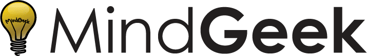
The decision of using a bulb was accurate at the time.

The bulb express creativity, innovation, and ideas, but giving it too many details and making it as a cartoon it could be related to a kid’s audience, young, amateur among others.

This is the opposite message to their philosophy which is basically a global and multinational company.

Also it is possible to see how it is difficult to integrate the logo in different formats like social media, websites and some applications (see examples above), the logo doesn’t fit and it’s removed from the wordmark.

It’s not recommended to have the company’s name in a logotype twice, because that goes against simplicity and the one inside the lightbulb is too hard to read.

the font family selected for the wordmark is Century Gothic. This was a good choice because it fits perfectly with the technology environment.

However, this font’s family is limited and it just have 2 versions: regular and bold.

Using a bigger font family is going to increase the possibilities in terms of application, like social media, presentations, brochures, etc.

The logo also have some structural problems. It is possible to think that this issue is a small thing but subconsciously our brain always know when things feels right. 

In a brand strategy small changes make a huge difference, and this changes can improve positive in how everyone remember our company.

The Proposal

Visual identity start with deep research of brand metaphors and attributes. The goal is to take the same bulb’s concept to describe themselves, giving it a logical evolution.

This is extremely important to get the right feeling of a visual brand identity, using this concepts that sense two strong attributes were selected: Smart and Global.

Brand Attributes

Smart
Global

Sketching

Symbol Construction

Click on image to enlarge

Golden Ration
Structure
Structure
Stroke Thickness
Stroke Thickness
Angle Cut
Angle Cut
Filling
Filling
Final Shape
Final Shape

Recommended Typeface

Gilroy font family has been developed to meet today’s typographical requirements, determined and precise in every aspect of design.

This font comes in 20 weights, 10 uprights and its matching italics.

It is the perfect replacement for Century Gothic because it’s a modernsans serif typography with a geometric touch, which makes it versatile and able to be used in differents formats including websites, mobile apps, branding, etc.

Color Palette

The main palette color will keep the yellow as principal color, but changing the black to a dark grey and white

#FFC222
#262524
#FFFFFF

Logo presentation

White background
Black background

Responsive options

A responsive logo is the term given to a primary logo that exists in several, slightly different and easily scalable variations.

The need for a flexible/responsive logo design, has grown with the demands of a digital environment.

Along with a full brand name used for print, a logo also requires a simplified short-form version. A successful responsive logo must be recognisable even at the top of your browser – as a tiny 16×16 pixel favicon.

Vertical
Horizontal
Compress
Minimum

Safe space

Vertical
Horizontal

Color variation

Monotone

Yellow
Black
Grey

Duotone

Yellow
Black
Negative

Applications

Stationery

Merch items

Workroom spaces

mg-color-003
Belmiro Pereira

Product Designer & Brand Designer.

University Rafael Belloso Chacin

Bachelor in Graphic Design

2000 - 2005

Montreal

Quebec, Canada