Virtual Tea Guide for DavidsTea App
DavidsTea wanted to create a mobile app feature to serve as a virtual tea guide, helping customers explore and discover products within an extensive catalog of options. With over 150 unique teas, customers often felt overwhelmed and unsure about which products suited their preferences.
The challenge was to design a solution that simplified product discovery, educated users about tea varieties, and personalized recommendations, while keeping the brand’s vibrant, approachable vibe. This innovative approach earned the IDEA 2024 Winner Award.

The Project Team Included
- Product Manager: Defined requirements and aligned stakeholders.
- UX Researcher: Conducted user research and analysis.
- Copywriter: Created engaging content and messaging for the product.
- Visual Designer: Worked on branding and UI aesthetics.
- Developers: Implemented technical changes and app updates.
My Role
As the Product Designer, I led the UX/UI design process, from research and ideation to prototyping and usability testing. I collaborated closely with the UX researcher and developers to ensure the designs were user-centric and feasible.
Research Methods
User Interviews
Conducted 15 interviews with loyal and first-time users to understand their preferences and challenges in choosing teas.
Surveys
Distributed a survey to 186 users, focusing on tea preferences and discovery habits.
Analytics Review
Examined website and in-store data to understand popular choices and frequent questions.
Competitive Analysis
Analyzed features from competitor apps like Teavana and T2 Tea to identify industry best practices for product discovery.
Study Findings
Flavor Preferences:
- 68.7% of users favored fruity or floral teas.
- 52.4% were interested in caffeine-free options for evening consumption.
Shopping Behavior:
- Users often explored new teas but were hesitant to purchase without recommendations or tasting options.
- 31.2% of respondents mentioned they abandoned the web because they couldn’t find teas that matched their mood or occasion.
Knowledge Gaps:
- 37.8% wanted guidance on brewing techniques for optimal taste.
- 37.8% wanted guidance on brewing techniques for optimal taste.
Mobile App Preferences:
- 79.6% expressed interest in a feature that could recommend teas based on their taste preferences or mood.
- 44.7% desired educational content embedded directly in the app.
Target Group’s Pain Points
Overwhelming Choices
Users felt lost navigating an extensive catalog without guidance
Lack of Personalization
Recommendations were generic and didn’t align with individual tastes.
Limited Knowledge
Customers wanted to learn more about tea types, origins, and brewing methods.
Static Experience
The current catalog lacked interactive features to engage users.
Showcase Features or Product Ideas
Interactive Tea Guide
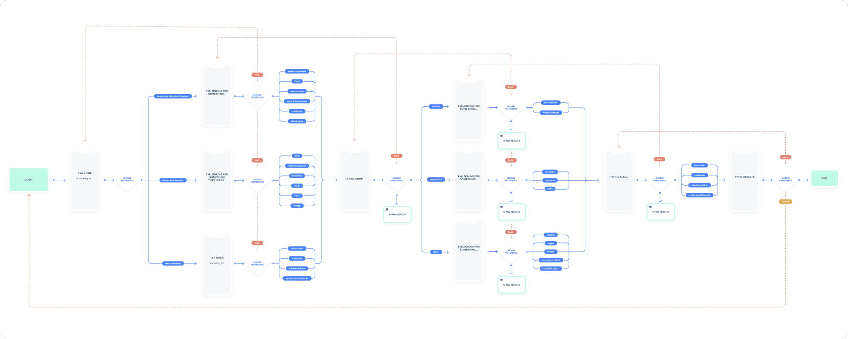
A dynamic guide to help users filter teas by flavor profiles, caffeine levels, and brewing preferences.
Personalized Recommendations
A quiz-based feature to suggest teas based on user inputs.
Educational Content
Integrated articles and videos on tea origins, brewing techniques, and pairings.
Visual Enhancements
High-quality images and AR functionality to view teas in 3D or explore packaging.
Wishlist and Sharing
Allow users to save favorites and share recommendations with friends.
Mid-fidelity Wireframes
These wireframes allowed for stakeholder and user feedback before progressing to high-fidelity designs.

High-fidelity Wireframes
Designed prototypes in Figma to simulate the app’s features and functionality.


Learning Experience
Combined tailored recommendations with educational content, introducing users to tea varieties, flavor profiles, and brewing techniques through engaging, targeted questions. This feature addressed knowledge gaps while empowering users to make informed choices and discover teas that matched their preferences.


Design System
To ensure consistency and scalability, a comprehensive design system was developed for the app. It included a cohesive set of reusable components, typography styles, color palettes, and interaction patterns aligned with DavidsTea’s vibrant branding.
The system streamlined collaboration between designers and developers, ensuring that every element—buttons, icons, and input fields—maintained visual and functional consistency across the app. Accessibility guidelines were also integrated to create an inclusive experience for all users, with considerations like sufficient contrast ratios, scalable fonts, and clear interactive states. This design system not only enhanced efficiency during development but also laid the foundation for future updates and feature expansions.
Typography
The typography for the app was selected to balance readability and brand personality. Oxtail was used for bold headlines, creating visual impact, while Omnes ensured clear, readable body text, providing a balanced and approachable design.
Colour palette
The app’s scalable color palette featured vibrant teals and greens for a fresh, inviting look, balanced by neutral grays and blues for readability. Accent colors highlighted key actions, and accessibility standards ensured usability across all components.
Grid System
4-column grid system with 16px gutters to ensure a clean, organized layout. The grid supported alignment and spacing across all components, creating a balanced and user-friendly interface.

Iconography
The app featured two types of icons for clarity and usability: filled icons were used for main navigation to ensure prominence, while outlined icons were applied to smaller formats for a lighter, more refined appearance. This distinction enhanced visual hierarchy and maintained consistency across various screen elements.
Visual elements
Featured custom illustrations, subtle animations, and high-quality images to enhance its vibrant and approachable personality. These elements added depth to the design, improved user engagement, and created a visually cohesive and immersive experience.


