About
This project conducted brand identity design for Ruta vinotinto (burgundy route), a YouTube channel run by sportscaster Fernando Petrocelli with over 50,000 subscribers.
This channel aims to follow all the steps involved on the way to the next world cup qualification of the Venezuelan National Soccer Team.
The concept
It is important to understand a product’s uniqueness and value before beginning any branding process. To start, brainstorm and write down as many attributes as possible, and then identify a few that are most effective.
Them some few promising directions were found. Next, a few selected directions were explored, testing them to make sure the final decision was justified.
- Route
- Road
- Gps
- Transit sign
- Soccer
- Team shield
- Ball
- Target
Core values reflected in branding
Typography
Inspired by European typographic trends between the second half of 19th century and first half of the 20th. It looks rational and geometric. However, it is optically corrected and balanced.
This font face is designed to be used mostly for headlines, visual identities or short sentences, both in big and small sizes. Novecento comes in 32 styles.
Color palette
To create the young palette, those tones were taken decomposing the main color, which was burgundy. The idea is to create a colorful palette based on Venezuelan national soccer team jersey.
The bright red color is the primary color, while the violet color is used to create the gradient for the background, then a roast lime is chosen as a supplementary color to contrast with the gradient background.
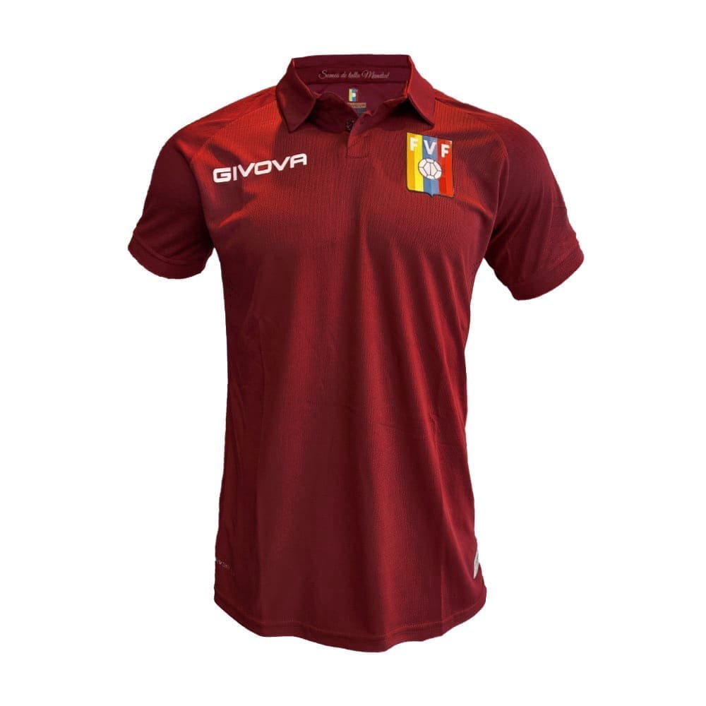

Color’s decomposition
Primary color
#EC1C24
Secondary color
#8419D1
Gradient of
secondary color
Supplementary
#EBFF85
Font Color
#3A3F4D
Logotype versions

Color Variation
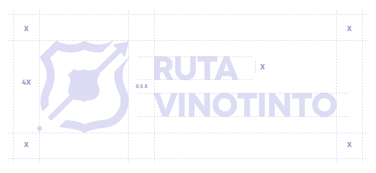
Structural adjustment
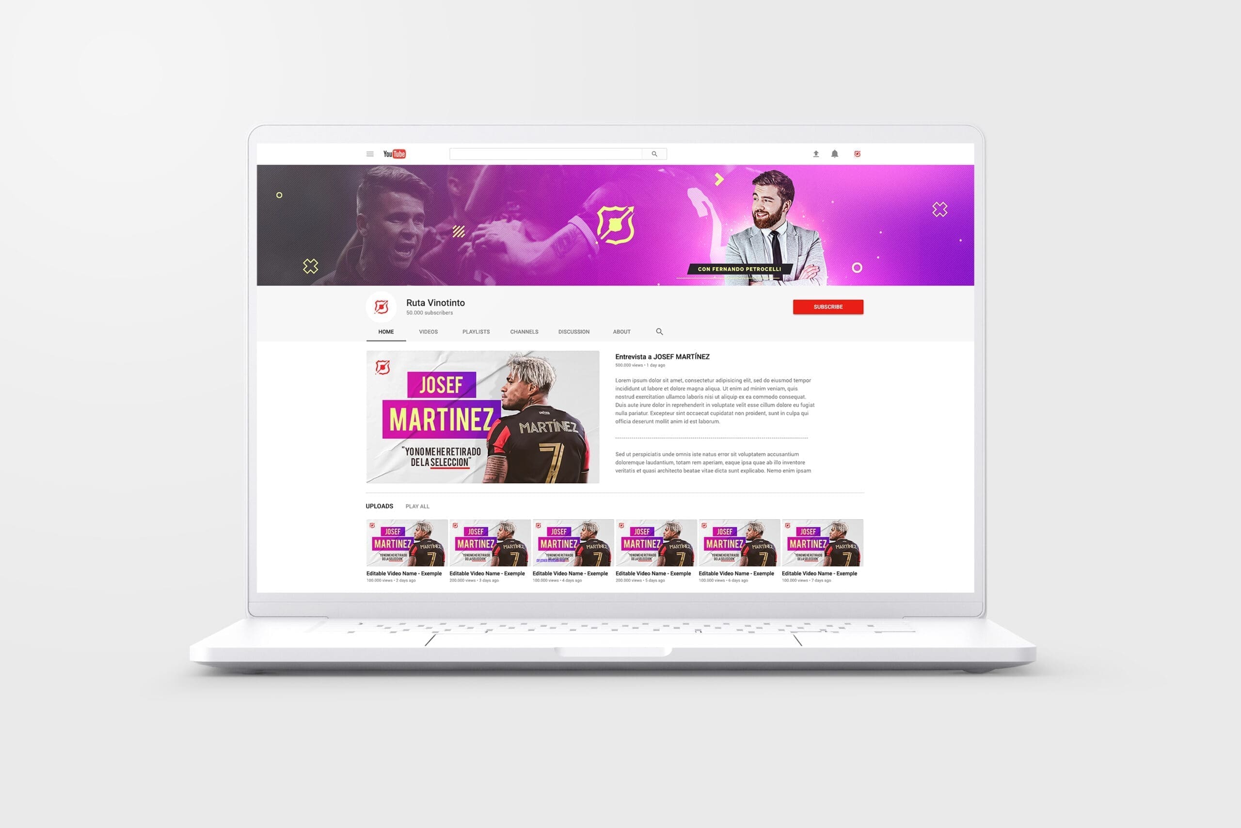
Applications
Intro animated

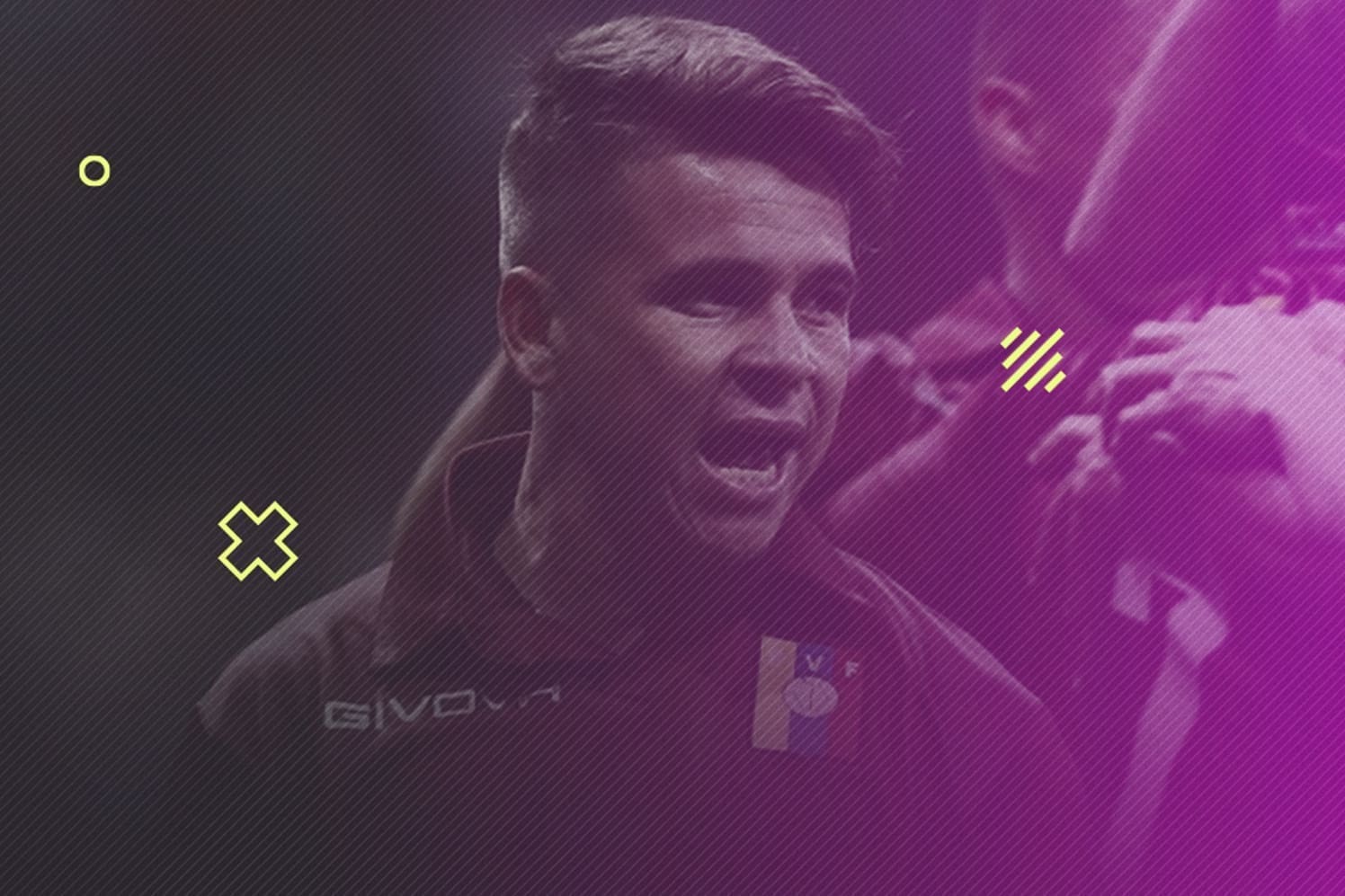
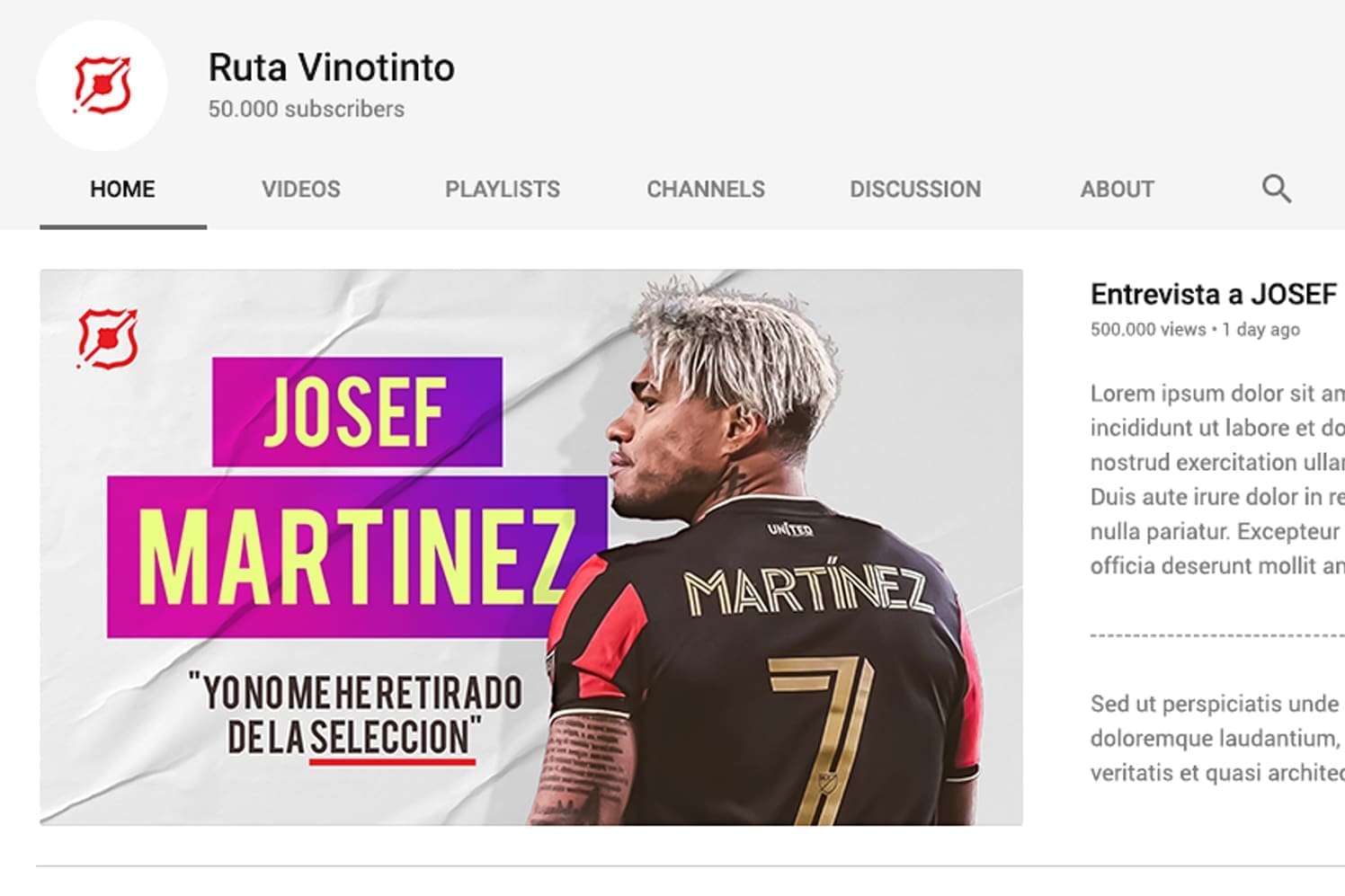
Channel banner and thumbnails
